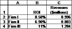
Consider the case of graphically representing two sets of numbers where each set is significantly different in scale from the other. For example, one set of numbers is scaled in the thousands while the other is scaled in fractions. This happens in many circumstances – comparing three firms on two dimensions such as revenues (which might be measured in millions of dollars) and return on investment (where the ROI is a percentage), or measuring the performance of a manufacturing plant using quantity produced (which might be in thousands or even millions of units) and injury rate (which, typically, and hopefully, will be a very small number). As an example consider three firms measured on Return on Investment and on Annual Revenues as shown in Table 1.
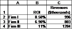
Table 1
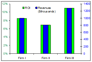
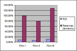
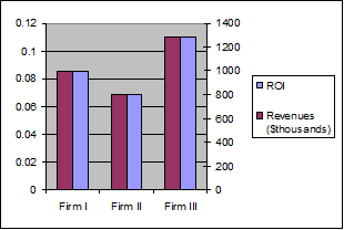
We might want to see the results graphically as in the left panel below but more likely as on the right.
The problem is that if we create the default clustered column chart, the result will look like in .
The magnitude of the ROI is so small that it is overwhelmed by the annual revenue figures. Not to mention the weird y-axis. Excel sets the format from the first series (ROI in percentage), but it sets the scale based on all series plotted on that axis. So, it must accommodate the largest number - 1284.
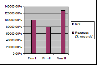
Figure 1
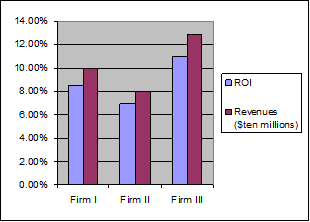
One way to solve this problem of the ROI becoming ‘invisible’ is to scale down the revenue numbers. Suppose we replace the $thousands by $millions. Then, we would get
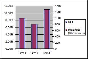
While the result is somewhat better, the variation on the ROI numbers is still lost. What if we scaled the results further and used tens of millions of dollars?
The result (see the figure on the right) looks a lot better but the language becomes rather unnatural. While it is common to refer to numbers as “800 thousand,” or even “point eight million dollars,” one doesn’t expect statements such as “our revenues last year were 0.08 ten million dollars.”
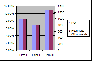
Returning to our original numbers, one way to address this disparity in magnitude is through a secondary axis. Instead of plotting the numbers on the same axis, move one of them to the secondary axis. To do so, double-click the plotted series and in the resulting dialog box, from the Scale tab, select ‘Secondary axis.’
Note the presence of the two axes: one scaled in percentage the other in hundreds of thousands. But we still don’t see two bars. Excel formats the series on each axis independent of the other axis. So, in our case, since each axis now has only one series, Excel has centered each over the Firm N label, with the unfortunate result that one series completely overlaps the other.

A simple fix for this is to change the ‘Gap Width’ option. Double-click the visible series, and in the resulting dialog box, from the Options tab, set the Gap Width (the default is 150) to 200. Now, the ROI bars are just barely visible.

Double-click the ROI series and set its Gap Width to 100.
Of course, you can experiment with different gap width settings to get an aesthetically appealing result.
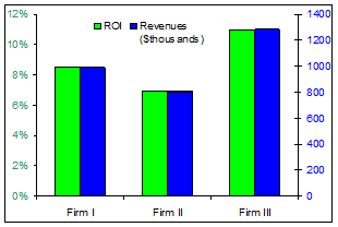
The other solution is somewhat more complex but shows the result in the form of what looks like a normal clustered column chart, i.e.,
To accomplish this, add the two data series a 2nd time to the chart. In our example, select B2:C4 and drag-and-drop onto the chart. Now, the chart will look like:
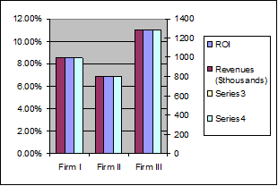
Select the dummy series that corresponds to the ROI (select any visible column and use the up arrow key until Excel selects the desired series). Now, move this series to the primary axis (select Format | Selected Data Series..., from the Axis tab, select ‘Primary Axis’).
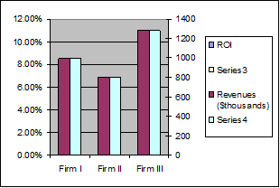
Next, select the dummy series that corresponds to the Revenues (it should be Series4 shown in green in the example). Make two formatting changes to it. Double-click to access the Format Data Series dialog box. From the Series Order tab, move Series4 to the top (select it in the field on the left and then use the Move Up button). From the Patterns tab, set the Border and Area to None.
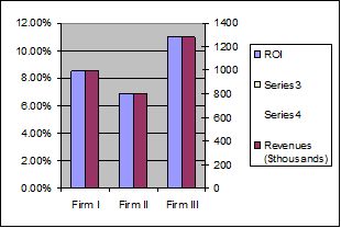
Finally, select the legend, pause, then select the Series3 legend and use the Delete key to remove it. Do the same for the Series4 legend.
Excel’s default color schemes and format choices leave a lot to be desired. The final changes improve the presentation:
Change the color of the series patterns to Blue and Green respectively (double-click each series and from the Patterns tab in the Area section select the appropriate color).
Double-click each of the axes. From the Font tab, select a font size of 9pt and turn off ‘Auto Scale.’ For the primary (left) axis, set the font color to Sea Green and in the Number tab set the number of decimals to 0. For the secondary (right) axis, set the font color to Blue.
Double-click the plot area and remove the border and the area color. From the Chart | Chart Options… menu, from the Gridlines tab, uncheck the gridlines selection.
Double-click the legend and from the font tab, select a size of 9pt. Turn off ‘Auto scale.’
Move the legend to a space above the series. Now, select the plot area and drag the edges to cover as much of the chart as possible.