Visually showing the progress towards a goal can be done in a few different ways. The commonly one seen uses two columns, one in front of the other with the front column showing the progress and the rear column showing the goal.
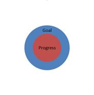
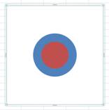
Another way requested by someone was to use what could be described as a pie-on-pie. A large circle represents the goal and an inner circle represents the progress to date.
Another way to show progress – and this includes information about the progress made over time – would be to use a Line or Area chart where the X axis measures time.
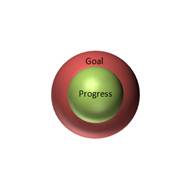
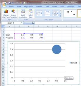
The easiest way to do this is to create a Bubble Chart. Plot the goal and the current progress with the same x and y values and adjust the scale of the bubbles to suit. The results using the regular bubble chart and the 3D chart are shown below
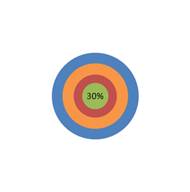
One can also create a chart showing multiple benchmarks in the form of concentric circles.
Start with a table in which the last column represents the goal and the progress quantities.
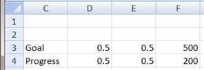
Select the data in the last 3 columns and create the Bubble Chart (Insert tab | Charts group | Other Charts drop-down | Bubble).
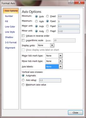
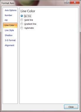
Next, delete the legend (select it and press the delete key) and for each of the axis set the maximum value to 1 and hide the line, the major tick marks and the axis labels. To do so right-click the axis and select Format Axis… Then, follow the dialog boxes below.
Hide the horizontal gridlines (Select the chart then Layout contextual tab | Axes group | Gridlines drop-down | Primary Horizontal Gridlines sub-menu | None option).
Now, right click the plotted series and select Format Data Series… In the Series Option tab set the ‘Scale bubble size to’ to 300 and in the Fill tab check ‘Vary colors by point’.
Finally, select the chart itself and resize it as desired.
To add the labels use the technique for adding custom labels to a chart.
To create the concentric circles chart, designate the benchmarks and create a bubble chart with that many data points. For example, to show progress in terms of percentages using 100%, 75%, 50%, and 30% as the current progress, use the table below.