Poornima on July 10, 2011:
This is really simple stuff, but great handy stuff when one is looking for this information really quickly. Many thanks !
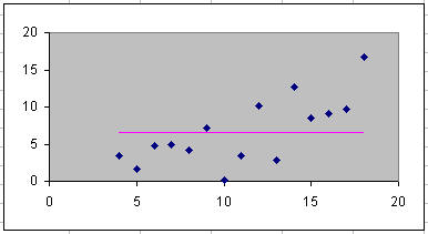
There are many instances when one needs to add a visual indicator to a chart. This could be a line indicating a goal of some sort. Or, it could be a line showing the average of the graphed data. In TQM control charts, it could be a line so-many standard deviations from the mean.
One way draw such a line would be to calculate the values in cells in a worksheet, and plot these cells on the chart. Another way is to use a named formula, which means that the charted threshold values do not show up on the worksheet. This tutorial shows how to use a named formula.
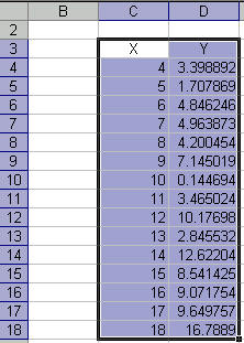
The example uses the data set below. Of course, you will use your own data.
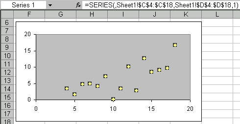
First, create the chart from the data set. The example uses a XY Scatter chart.
Next, define two names. The first, aRng, is just for convenience. The second, meanLine, is the one that generates as many numbers as in the original data, each equal to the average. How?
![]()
How
does the meanLine named formula work?
(a) OFFSET(aRng, 0,1) selects the 2nd column of data,
i.e., the y-values.
(b) AVERAGE(...) gives the average of y-values.
(c) ROW(aRng)/ROW(aRng) creates an array of ones.
The array has as many data points as in the original
data.
Multiplying (b) by (d) replaces the ones in the array by
the average value.
Next, add a new series to the chart, using this newly defined name. How?
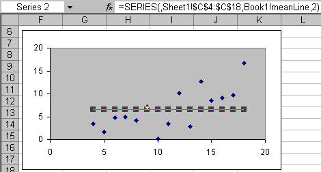
Format the new series to hide the markers and show the line. The job is done!