Customizing a chart
The Default Chart
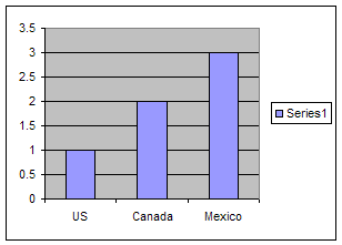
The default chart created by Excel is relatively plain. Each series is represented by a single color.
In this tutorial, we look at how one can improve the
presentation of a chart.
 Color Gradients, textures and
patterns
Color Gradients, textures and
patterns
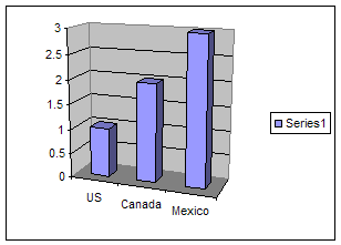
 3-D effects
 Custom Graphic
 Custom graphic for each data point
 Combined effects
 Formatting other
components
Formatting other
components
Final Thoughts
|
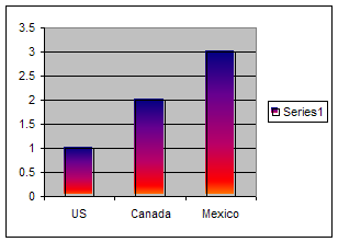
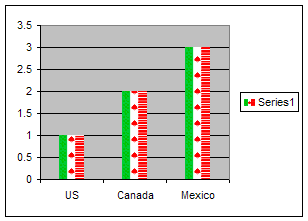
Color Gradients, textures and
patterns In some ways, this is the
easiest to accomplish. Double-click the plotted
series.
In the Format Data Series dialog box, click the
Patterns tab.
Select the Fill Effects... button.
In the Fill Effects dialog box, experiment with
the various possibilities in the tabs:
Gradient,
Texture, and
Pattern.
The effect on the right is the result of a Gradient
setting of Preset and the preset selection of
Early Sunset. |
 |
|
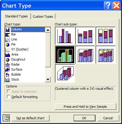
| 3-D effects
Select a chart type with a 3-D effect (with the chart
selected, select the menu item Chart | Chart Type...
In the resulting dialog box, select an appropriate
sub-type (see below)
Experiment with the final effect by changing the 3-D
perspective (Chart | 3-D View...) Also,
customize the floor and wall formats by double-clicking on
each and choosing an appealing setting for each. The
horizontal lines in the chart on the right are gridlines.
Delete them with Chart | Chart Options... | Gridlines
tab or customize them by double-clicking on one and
adjusting the color and type settings. |
 |
|
| Custom Graphic
There are two ways to add a custom image to the chart
One is to select the graphic from a a file:
- Double-click the plotted series, and in the
Format Data Series dialog box, select the Patterns
tab
- Click the Fill Effects... button
- In the Fill Effects dialog box, select the
Picture tab, and click the Select Picture...
button.
- Browse to the appropriate folder and select the
desired image file.
The other method is sometimes more convenient, especially
when dealing with clip art images. It relies on an
undocumented capability of Excel.
- Copy the image of interest (either in Excel, in the
Clip Art Manager, or in some other program).
- Select the plotted series in the chart. Paste
with CTRL+v.
|
 |
|
|
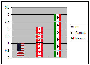
Custom graphic for each data point Either of the
custom graphics techniques illustrated above works here too. Using the Copy + Paste method to add images:
- Put all the desired images in your XL worksheet (with
Insert | Picture > Clip Art... or Insert | Picture > From
File...) or by pasting from another application.
[If these images look like they are cluttering up the
workbook, delete them once the formatting is complete.]
Repeat the steps below for each column.
- Select and copy the image of interest.
- Select the chart, click on the plotted series. This
will select all the columns.
- Pause and click on the column that corresponds
to the copied image. This will select just the one
column.
- Paste the copied picture with CTRL+v.
Once done with all the columns, experiment with how the
image is shown within the
individual bars.
- Double-click the bar (just the one bar, not the
entire series).
- In the Format Data Point dialog box, select the
Patterns tab, then click the Fill Effects...
button.
- In the Fill Effects dialog box, then the Picture tab.
Towards the left bottom are three Format
options: Stretch, Stack, or Stack and scale to X
units/picture. Try them out.
On the right, the US flag is Stretched, the
Canadian flag is Stacked and the Mexican flag is
Scaled to 0.5 units / picture.
Also note that the legend that read Series1 in
each of the above examples, now identifies each data point
uniquely. This duplicates the contents of the x-axis
labels. The example on the right deletes the axis
labels (Double-click the x-axis. In the
Format Axis dialog box, select the Patterns tab,
then set the Tick Mark Labels to None.
|
 |
|
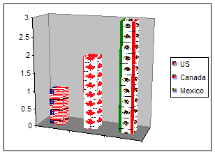
Combined effects
(3D chart with a custom graphic for each data point)The
example to the right combines the 3-D effect with a
customized image for each data point. Each image was
stacked and the gridlines were removed. |
 |
|
Formatting other
components
One can also add customization to the chart area or the plot
area. Just keep in mind that in these cases, only one
of the two techniques illustrated in the Custom Graphic
section above works. Since the copy+paste technique
doesn't work (try it and see what happens), one must select
a picture from a file:
- Double-click the chartarea (or plot area), then the
Patterns tab
- Click the Fill Effects... button
- In the Fill Effects dialog box, select the Picture
tab, and click the Select Picture... button.
- Browse to the appropriate folder and select the
desired image file.
It is possible to set both an image for the chart area
and for the plot area as shown on the right. Of
course, since the plot area is enclosed in the chart area,
its smaller image is embedded in the larger image of the
chartarea.
Note that the axis have been reformatted to use a white
color font rather than the default black. |
 |
|
Final
thoughts
Not all charts are created equal. Excel supports
different types of formatting for different types of charts.
What works for a column chart may not be meaningful for a
line chart or a XY scatter chart.In addition, the use of
combination charts requires Excel to further constrain the
formatting options.
This tutorial demonstrated how one can custom format a
chart. Try the ideas and techniques on your own chart.
If Excel can support what you want to do, it will. If
not, try something else. |
|
|