This tutorial demonstrates how to create the effect of a chart with distinctly differently y-axis plotting very different sets of values while sharing the same x-axis. The sample chart (Figure 1) shows temperature, speed, and volume on the y-axis plotted against dates on the x-axis.
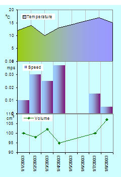
Figure 1
Note that with Excel this is a simulated effect. There are actually three separate charts, formatted such that the overall effect is the one shown. Since there are three charts, maintenance, if required, will have to be done for each chart individually. Of course, using the techniques illustrated in the Dynamic Charts section of this web site could help simplify the maintenance.
Can this be automated? Yes, with a some limitations. Contact me at web-underscore-contact-at-tushar-hyphen-mehta-dot-cee-oh-em for a custom solution.
1) Start off by creating three charts for the data in Figure 2. Each chart plots the dates in column A on the x-axis and the appropriate column on the y-axis. The chart plotting volume is a line chart, that plotting speed is a column chart, and the temperature chart is an area chart.
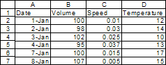
Figure 2
The resulting hree charts should look as in Figure 3.
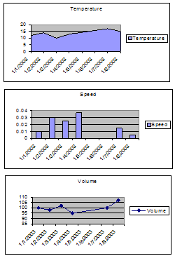
Figure 3
Adjust the chart sizes so that they are approximately the desired size. We will fix the exact size later. Position the charts so that they are in the right top-to-bottom sequence. See the result on the right.
2) Delete the chart titles from each of the three charts. For the top 2 charts, hide the x-axis. To do that, double click the x-axis, and in the resulting dialog box, in the Patterns tab, set all the attributes to None.
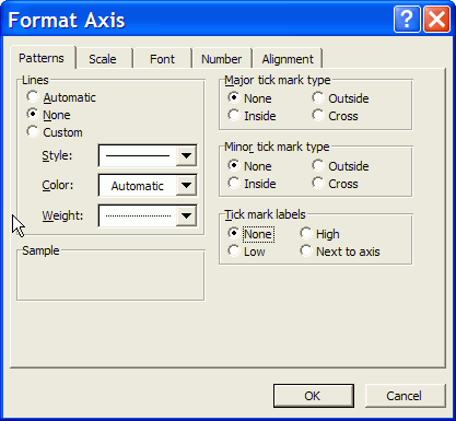
Figure 4
3) For each of the charts, resize the Plot Area so that it is as large as possible in all four directions.
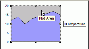
Figure 5
The result should look like Figure 6.
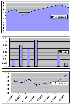
Figure 6
4) For all three charts, delete the plot area formatting. Do so by double-clicking the plot area, and in the resulting dialog box, set the Areas to None.
A quick way to duplicate an action in Excel is to use the F4, the Repeat, key. So, set the area of one chart to none, then select another chart and press F4, and finally, select the 3rd chart and press F4 again.
Also, remove the horizontal grid lines and add the vertical grid lines. Do so by selecting each chart in turn, then setting the appropriate options in the menu item Chart | Chart Options... | Gridlines tab. Note that the F4 (repeat) technique also works here.
Finally, set the font size for every chart element (x-axis, y-axis and legend) for each of the three charts to 9 point and turn off Automatic Resize. To do so, double-click the element, say the x-axis, and click on the Font tab. In there select the appropriate values.
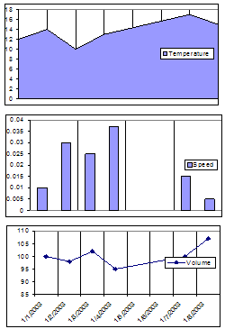
Figure 7
5) Resize the graphs so that they are the same size and properly aligned. First, select all three together. To do so, click one of the charts. Then hold down the SHIFT key and click each of the other two.
Note that when the chartobject is selected the selection rectangle is bounded by circles. Contrast this with the filled squares that indicate that the chart is selected.
Now, right-click and select Format Object. In the Size tab, set the width and height as desired. For the purposes of this tutorial, select 2 inches by 3 inches.
With all three charts still selected align the left edges. Do so by selecting, from the Draw toolbar, Draw ▼ | Align or Distribute ► Align Left.
Do the same but select Align Center to align the centers of the three charts (see Figure 8).
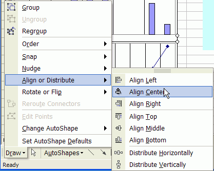
Figure 8
6) Note that in Figure 7 the middle chart has fewer gridlines than the other two. To fix double-click the x-axis of the middle chart and from the Scale tab, set the Major Unit to 1.
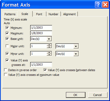
Figure 9
7) Notice that even with the three graphs set so that the top of one touches the bottom of the one above it, there is a gap in the vertical gridlines (Figure 10).
Figure 10
To close that gap, we need to overlap the charts.
7a) For that to be effective, we need to make the chart area and the plot area transparent. To do so, for each of the three charts, double-click the chart area and in the Patterns tab set both the Border and the Area to None. Yes, the F4 repeat method should work. If the cells under the charts are still not visible, set the Area of the PlotArea to None for each of the three charts.
7b) Now, select the middle chartobject with SHIFT+click on the chart. Note that the bounding rectangle should show circles and not filled squares. Now, use the UP arrow key to nudge the chartobject so that the vertical gridlines just touch the x-axis line of the chart on top.
Don't try and make the vertical lines from the different charts line up. We'll do that later.
Given that the chartarea and the plotarea are set to none and the gridlines are aligned with the x-axis, the result will look a little messy (see Figure 11).
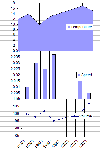
Figure 11
8) To reduce confusion, we need to block the sight of the cells under the charts. To do so, create a rectangle from the Draw toolbar and position it so that it covers all three charts.
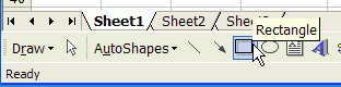
Figure 12
8a) Double-click the rectangle, and in the resulting dialog box, from the Colors and Lines tab, from the Color drop down box select an appropriate color. For this tutorial, the selection was Light Turquoise.
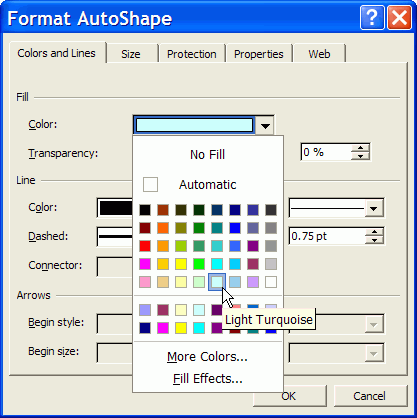
Figure 13
8b) Finally, with the rectangle still selected, right-click and select Order > Send to Back.
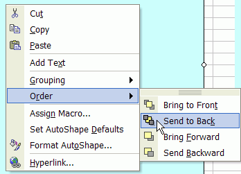
Figure 14
The result is shown in Figure 15.
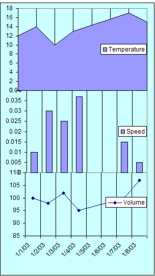
Figure 15
9) It's time to align the vertical lines.
In Step 3, we set the plotarea for each chart to the largest possible. So, the only way to align the y-axis of the different charts is to use the right-most axis as the base.
9a) In this tutorial, the y-axis for the middle chart is the right-most of the three y-axis. So, for each of the other two charts, shift the plotarea's left edge so that all the y-axis are aligned. Note that holding down the ALT key while dragging with the mouse will allow for much finer movement.
9b) Similarly, align the right edges of the plotareas so that all are aligned with the one that ends most to the left. In the example, that is the bottom most chart.
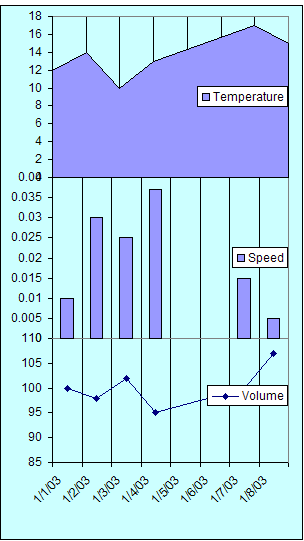
Figure 16
10) Final Touches
This section may seem abbreviated but it does involve some amount of work. The reason it is not documented in detail is that it doesn't have any direct impact on simulating the Stacked Charts effect. It does, however, help improve the quality of the display, effectively converting Figure 16 into Figure 1.
10a) Format the legend: For each of the charts, double click the legends and set the border to none. Position the legend as desired.
10b) Custom format the plotted series:
For the area chart, double-click the charted series. From the Patterns tab, in the Area section, select the desired color.
For the two-color effect, click the Fill Effects... button, then in the Fill Effects dialog box, in the Gradient tab, select the Two Colors option and set colors and Shading styles as desired (see Figure 17).
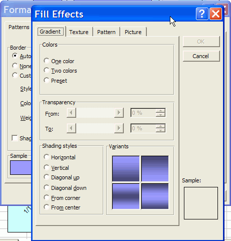
Figure 17
Setting Two-Color patterns for an area or a
column chart
For the column chart, double-click the charted series. From the Patterns tab, set the Border to None. In the Area section, select the desired color.
For the line chart, double-click the charted series. From the Patterns tab, set the line and marker colors as desired.
10c) Reduce the clutter on the y-axis. Double-click the y-axis in each chart and adjust the Major Unit to get fewer labels. In the tutorial, the area chart major unit was changed to 5, for the column chart to 0.01, and for the line chart to 5.
10d) Add the y-axis labels: Do this by adding a text box. Click in a chart and start typing the label's text. Excel will automatically create a textbox. In this box, individual characters can be formatted independently of one another. Do so as desired and position the text box so that it looks like a y-axis label.
10e) De-emphasize the vertical gridlines. For each chart, double-click the gridlines, and in the resulting dialog box, from the Patterns tab, select a light color. In this tutorial it was Gray-25%.
And, voila! The result in Figure 1.