There is no convenient way to use Excel to draw a Gantt chart as one would need when managing a project. The only way to do so is to plot the correct number of series as bar charts and after that one must format the various points so as to achieve the effect of having 'floating' bars within an Excel chart. This add-in automates the job and updates the associated chart as the underlying data change.
The following simplified example demonstrates a Gantt chart as one might it in a project. Consider four people working on a project with busy times as shown below. John is busy in the period ending Jan 1, idle during the period ending Feb 1, busy from Mar 1 to May 1, etc.
The software provides tremendous flexibility since it leaves the interpretation of the data in the table to the user. For instance, in the table above the names of the people could just as easily correspond to tasks.
In addition, the interpretation of the dates at the top is also up to the user of the software. Each column represents a period that either starts with or ends with the specified date. Finally, the dates can be dates as in this example, or just a number indicating the number of days, weeks, months, or years since project commencement.
The Gantt chart corresponding the the information in Figure 1 would be:
After saving the file on the hard disk, unzip the GanttChart.zip file. Save the GanttChart.xla and the GanttChart.chm files in a convenient directory.
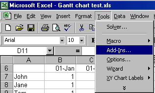
Run Excel and load the add-in by selecting Tools | Add-ins... (see Figure 3)
 |
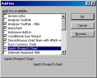
Click the Browse... button (see Figure 4), and locate and open the GanttChart.xla file saved in the previous step. Ensure that the checkbox next to the Gantt (Project) Chart entry is checked.
 |
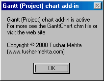
When the Gantt Chart add-in first loads it displays the following dialog as an alert that it is running:
 |
The Gantt Chart add-in is now available for use.
The add-in adds the Gantt (Project) Chart... item under the TM menu.
To create a Gantt chart, lay out the project data so that it forms a table as shown in Figure 1. Ensure that there is at least one empty row and one empty column to each side of the data. Select any cell within the table and select the Gantt (Project) Chart... menu item.
 |
The result will be a Gantt chart drawn with a number of series plotted in a bar chart and formatted so that only those bar segments that correspond to non-zero and non-blank table values are visible as shown in Figure 2.
Delete the chart created by the add-in.
When necessary, the add-in updates the chart to reflect changes in the underlying data . When changes are made, the ability to undo (Edit | Undo or CTRL-z) the last change is lost. This is an intrinsic feature of Excel and there is not much one can do about it.