Michael on May 16, 2012:
Good job in putting this together!
As usual there are still other options, at least in Office 2007.
You can insert a PIE shape, that can be found under the basic shape section. It looks like a 3/4 Harvey ball. It has two yellow handles that adjust for any shape you need. As any other shape you can set color, fill, outline, etc. as you like. Downside is that it is not linked to any cell value.
Another option is the conditional format, which is obviously linked to cell values. But there are almost no design changes possible (at least not in Excel 2007).
Harvey Balls are used to convey qualitative information.
Apparently, they were invented by someone at the Booz Allen Hamilton consulting
firm. Typically, they are small circles with a
portion of the circle black, representing the quality of whatever is being
evaluated. For a more detailed
introduction, see http://en.wikipedia.org/wiki/Harvey_Balls, from where I got
the image ![]() . The equivalent result in Excel:
. The equivalent result in Excel:![]() . Alternatively, an enhanced version in Excel
with color:
. Alternatively, an enhanced version in Excel
with color: ![]() . Consumer Reports (www.consumerreports.org,
from where I also got the next image) uses a variant of them in its ratings, 'above
average' ratings shown in red and 'below average' ratings in black:
. Consumer Reports (www.consumerreports.org,
from where I also got the next image) uses a variant of them in its ratings, 'above
average' ratings shown in red and 'below average' ratings in black: ![]() .
.
In Excel, there are three ways to create Harvey Balls: 'Unicode Characters', 'The Harvey Balls font', and 'Using Excel charts to simulate Harvey Balls'. We will look at all three in varying detail.
The first is to use specific Unicode symbols. While relatively easy to create, they are limited to the few symbols that look like Harvey Balls. Figure 1 lists the range of Unicode values that contains characters corresponding that look like Harvey Balls. As one can see only a few of the symbols are available.
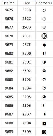
Figure 1
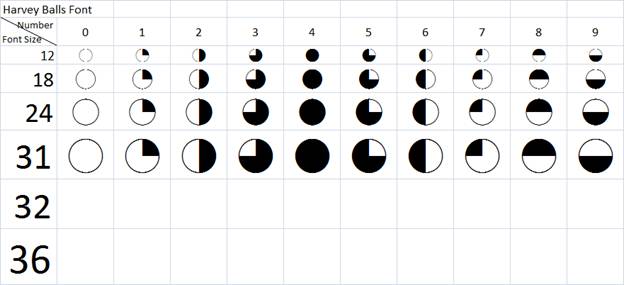
There is a Harvey Balls font that is available on the Internet. While nominally free, the author asks for a donation from those who find his work helpful. Visit http://www.ambor.com/public/hb/harveyballs.html to download the font, for installation instructions, and to make a donation. After downloading and installing the font, the numbers 0 through 9 when formatted with this font will show as one particular Harvey Ball. It is a quick and easy way to get 10 different types of partially filled circles. Since it is a font, one can change the color and even apply conditional formatting.
Since this is a font that changes the way numbers are displayed, we can color the display as desired and also apply conditional formatting. Start by entering the numbers 0 through 9 in a row.
![]()
Select the range and apply the Harvey Balls font. �This shows the range of options available with this font.
![]()
Now, select the range and change the font color to, say, blue.
![]()
One can even apply conditional formatting to this range. Select the range (or the entire row), then select conditional formatting (Home tab | Conditional Formatting drop-down | New Rule... button). Create 2 new rules as shown below
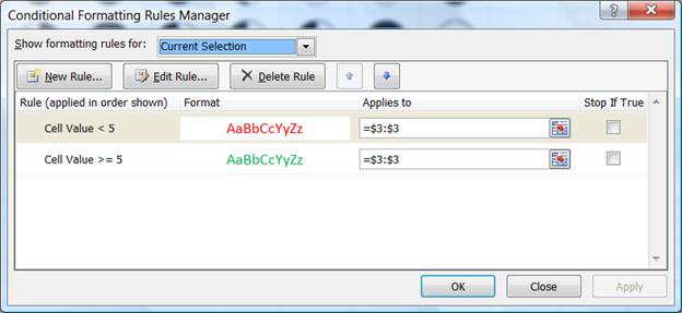
The result is that the range will look like
![]()
The downside of using this font is that the outline is not a perfect circle -- at least not on my computer using Excel 2007 on a Windows Vista Ultimate operating system with a separate graphics card. Even more surprising was that setting the font size to larger than 31 resulted in a blank display.
A Harvey Ball looks like a pie chart with just 2 elements. A small pie chart but a pie chart nonetheless. So, that's what we need to do. Create a pie chart and make it as small as required. Once we do that, we can duplicate this one chart as needed.
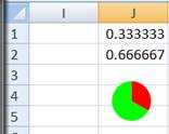
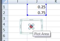
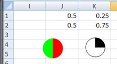
Start by entering in some cell, say J1 the value 0.25. In J2 enter the formula =1-J1. Select these two cells and create a pie chart.
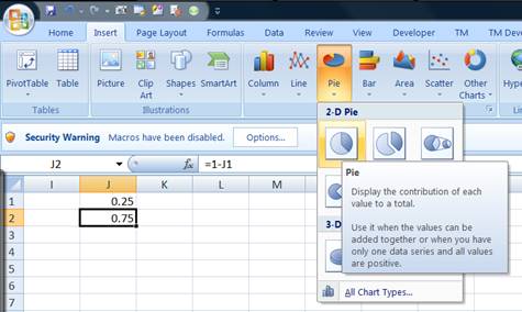
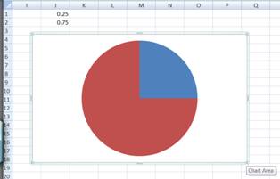
In the default chart, delete the legend. Then, hold down the SHIFT key and drag the right-bottom corner inwards so as to reduce the chart area.
 �
�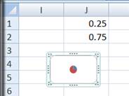
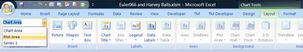
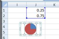
Then, resize the Plot Area so that the pie fills out the chart. If you have trouble selecting the plot area use the Chart Tools contextual ribbon | Layout Tab | Current Selection group | Chart Elements drop-down to select the plot area.
The two images below show the starting plot area and result of the plot area filling out the chart area.
 �
�
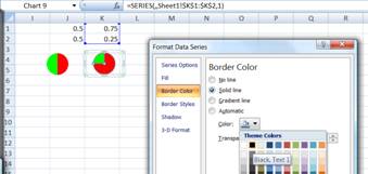
Next, format the data series so that the Border Color is None. Format the individual pie elements to have the desired color (I chose red and green) and finally, format the chart area so that the Fill is No Fill and the Border Color is also No Line. The result should look like:
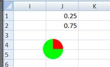
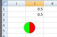
To change the shape of the Harvey Ball, change the value in J1 to something else, say 0.5
To create a second Harvey Ball, copy the formula in J2 to, say, K2. In K1 enter some number between 0 and 1, say 0.75. Next, copy and paste the chart so that there is a second pie chart in the worksheet.
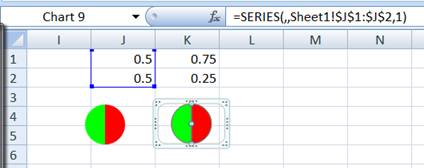
Select the data series of this second chart. In the formula bar, select the cell reference (it should be to J1:J2) and change it to K1:K2.
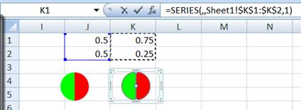
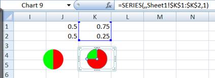
Press ENTER and the 2nd pie chart will now reference K1:K2.
To create the traditional black-and-white balls is a little difficult since we have removed the border. One obvious solution is to reinstate the border of the data series. However, that will mean that the circle will not be perfect when the ball has just one color. Try it yourself. Select the data series of the 2nd pie chart and format the border to, say, black.
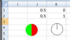
There is no way to get rid of the vertical line. Of course, if we remove the border altogether, we will be unable to distinguish the white ball from the background!
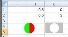
One workaround is to go ahead and remove the border color and then to format the chart area to some shade of grey. Another option is to fill the cells under the chart with a shade of grey. That is what I did to create the image in the introduction.
Of course, there is no reason why one must stay with the black-and-white balls when working with Excel. As we have already seen, one can use the full range of colors that Excel supports.
Another advantage of using a chart to represent a Harvey Ball is that we are not restricted to a few predefined shapes, in all of which the pie wedges are multiples of 1/4 of the circle's perimeter. We can easily create any size wedges. For example, to create a 1/3rd pie wedge, change the value in J1 to the formula =1/3.