The x-axis of a Column Chart can contains either category values (the x values are equidistant) or dates. Neither of these allows for a truly numeric x axis. This tip shows how to simulate a column chart that has cardinal numbers on the x axis (cardinal numbers contain a sense of ‘distance’ – e.g., 97 is 2 more than 95, 7 more than 90, and 3 less than 100). Of course, once the axis supports cardinal numbers it also becomes possible to convert it to a logarithm (or log) scale.
Starting with Excel 2007, Microsoft enhanced the charting module to provide greater formatting control over the chart elements. This makes it possible to make a XY Scatter chart look like a column chart!
Suppose we want to plot the data in x in a column chart.
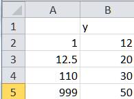
Figure 1
What we would like to see is as in Figure 2 and maybe even a logarithm scale on the x axis as in Figure 3.
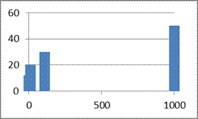
Figure 2
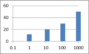
Figure 3
The idea behind simulating this effect is to create a XY Scatter chart, hide the default markers and add appropriately formatted error bars.
Start with a XY Scatter chart for the data in Figure 1. Remove the title and legend, if any.
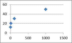
Figure 4
Add error bars: Select the plotted series, then Chart Tools context ribbon | Layout tab | Error Bars dropdown | More Error Bars Options… button.
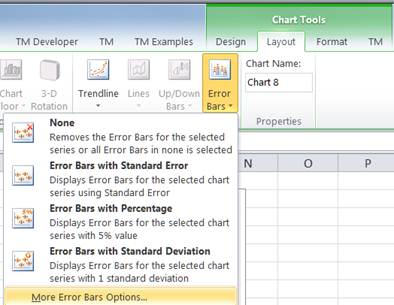
Figure 5
In the resulting dialog box, select 100% Negative error bars, change the Line Style width to 10pt, and format the line color as desired.
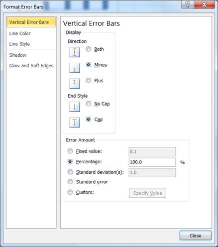
Figure 6
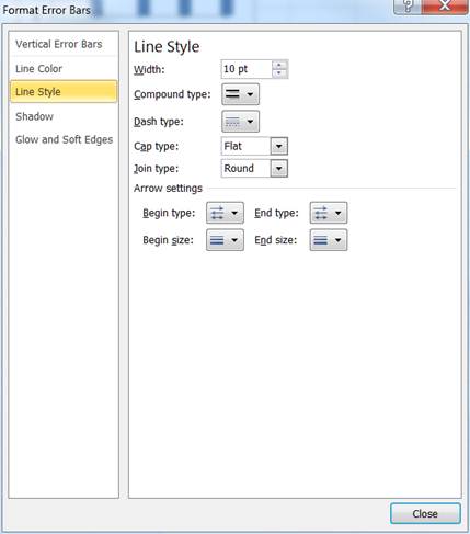
Figure 7
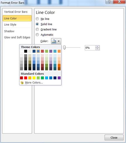
Figure 8
The chart should now look like
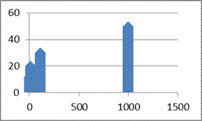
Figure 9
Format the series to have no marker: In Excel 2010, double-click the plotted series (in 2007 right-click and select Format Data Series…) and from the Marker Options tab, change the Marker Type to None.
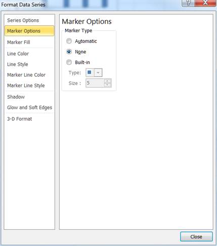
Figure 10
The result is in Figure 11.
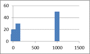
Figure 11
It may not be obvious, but the 1st column overlaps the y axis. It’s more apparent if the x-axis scale is a log scale. To make the change, double-click the x-axis, and in resulting Format Axis dialog box, in the Axis Options tab, check the Logarithmic scale checkbox. The result is in Figure 12.
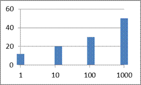
Figure 12
If the appearance of the 1st column is not acceptable adjust the minimum value of the x axis so that the no part of the column overlaps the y-axis. It will also be necessary to adjust the x-axis parameter ‘Vertical axis crosses’.
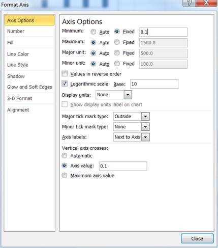
Figure 13
The final result is in Figure 14.

Figure 14