By default, Excel has a limited number of charts. That does not mean that those are the only charts one can create. It turns out that with a little imagination and creativity, we can format and configure the default charts so that the effect is like many other kinds of charts.
One of the more versatile of charts is the XY Scatter chart. We can use it as the base for many data visualization tasks. Recently, for a client, I used one to create a radial org chart as in Figure 1. Such a chart is also called a Node-Link chart or a Reingold–Tilford Tree[1].
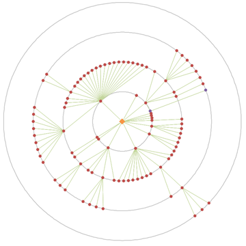
Figure 1 – Example of a radial org graph created in an
Excel XY Scatter chart
after removal of all identifiable information and the obfuscation of data
necessary to protect the client’s confidentiality.
A lot of “out of the box” work into making this chart. One key element was the set of equidistant concentric circles that provide a visual reference for the small colored dots. This note demonstrates how to create concentric circles in an Excel XY Scatter chart.
The easiest way to think of a circle is in terms of polar coordinates. In this coordinate system a circle is specified by its radius, R, and rotating the angular displacement, theta, from 0 to 360 degrees, which corresponds to 0 radians to 2*PI radians. Since Excel only understands the Cartesian coordinate system (X and Y axes), we will convert the polar coordinates to Cartesian coordinates with the formulas X = R * COS(theta) and Y = R * SIN(theta).
The easiest way to create the theta values is with a named formula (Formulas tab | Defined Names group | Name Manager button).
Create a name, Theta, with a scope of the active worksheet, and assign it the formula =(ROW(INDIRECT("1:361"))-1)*PI()/180. This creates 361 values going from 0 to 2*PI radians. In Figure 2, the active worksheet is named Sheet1.
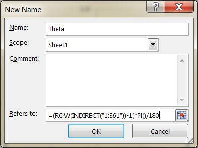
Figure 2
Next, create a named formula for the radius of the first circle. Call this name _C1R and give it a constant value of 1.
Now, create the X and Y values for the 361 points corresponding to the values in Theta with the named formulas:
|
_C1Xs |
=Sheet1!_C1R*COS(Sheet1!Theta) |
|
_C1Ys |
=Sheet1!_C1R*SIN(Sheet1!Theta) |
Table 1 shows all the named formulas created so far.
|
Theta |
=(ROW(INDIRECT("1:361"))-1)*PI()/180 |
|
_C1R |
=1 |
|
_C1Xs |
=Sheet1!_C1R*COS(Sheet1!Theta) |
|
_C1Ys |
=Sheet1!_C1R*SIN(Sheet1!Theta) |
Table 1
Start by inserting a blank XY Scatter chart (Scatter with smooth lines). If, by chance, the chart displays one or more series, select each series in the chart and delete it.
Next, add the series representing the circle: select the chart, then Chart Tools contextual ribbon | Design tab | Select Data button. In the resulting Select Data Source dialog box, click the Add button. In the resulting Edit Series dialog box, in the Series X values enter =Sheet1!_C1Xs and in the Series Y values enter =Sheet1!_C1Ys.
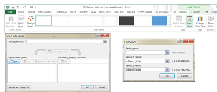
Figure 3
The result should look like Figure 4. Not quite the circle we were expecting, is it? But, it’s easy enough to fix.
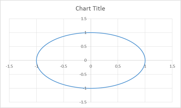
Figure 4
By default, Excel creates a chart that is wider than it is high. It also reserves some space for the chart title. So, delete the chart title and resize the chart so that it is as high as it is wide. To do so, select the chart, then Chart Tools contextual ribbon | Format tab | Size group | change the Height to equal the Width.
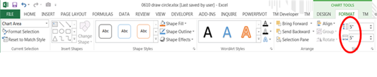
Figure 5
The chart will now look like Figure 6.
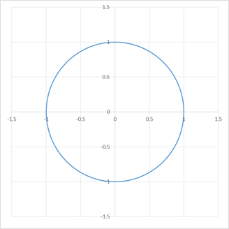
Figure 6
It is still not a perfect circle but it is difficult to spot the inconsistency. If you can see the flattening in either the vertical or the horizontal direction, use the mouse to adjust the plot area. There are automated ways of doing so but the process is not trivial. See Jon Peltier’s http://peltiertech.com/Excel/Charts/SquareGrid.html or my own shareware utility TM Chart Utilities (http://www.tushar-mehta.com/excel/software/chart_utilities/).
In the above example the x and y axes had the same minimum and maximum values. If that is not the case, it will be necessary to adjust them by hand to ensure the circle looks like a circle.
With the hard work done, adding a concentric circle is very straightforward. Analogous to the radius, X values, and Y values for the first circle, create the named formulas in Table 2 and then create a new series in the chart following the same steps as above except now we will use Sheet1!_C2Xs and Sheet1!_C2Ys as in Figure 7, which also shows the resulting chart.
|
_C2R |
=2 |
|
_C2Xs |
=Sheet1!_C2R*COS(Sheet1!Theta) |
|
_C2Ys |
=Sheet1!_C2R*SIN(Sheet1!Theta) |
Table 2
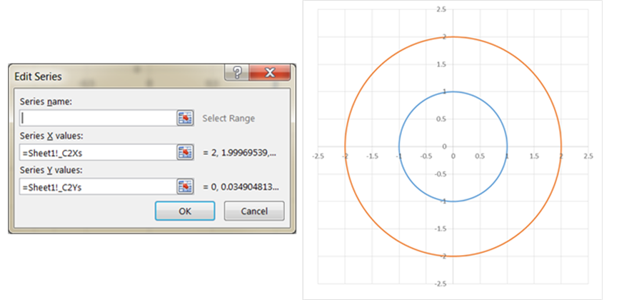
Figure 7