Purpose of the TM Plot Manager
Using the TM Plot Manager add-in
The TM Plot Manager dialog box
How TM Plot Manager draws smooth curves
Additional tips on TM Plot Manager
The software provides three capabilities.
1) Plot the value in a cell as a function of a precedent cell -- any precedent cell. The software does all the necessary computations and creates a chart in a separate worksheet,
2) Plot multiple such graphs (up to a total of 5) on a single chart.
3) The graphs are much smoother since the add-in concentrates its efforts on those parts of a graph with a greater curvature. The graph in Figure 1, the result of the TM Plot software, is uniformly smooth. By contrast, Figure 2, drawn from equally spaced values using Excel's Data Table feature, has an obvious kink where the graph crosses the x-axis.
Note that the self-installer version also installs an uninstall capability. To uninstall select scroll down to the entry.
If you chose to download the zip version, unzip the add-in file to a directory of your choice.
For installation instructions see common installation instructions. In Excel 2003 load the add-in. In Excel 2007, load the add-in.
In Excel 2007 or later, select .
Figure 3
In Excel 2003 or earlier, select
Figure 4
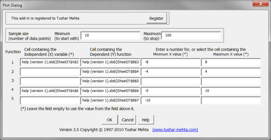
Figure 5
This is the cell that contains the independent variable. In most instances it is known as the x variable and its values will be graphed on the x-axis of the resulting graph. For example, consider a graph y = Log (x), with the formula in cell $A$2 being =LOG(A1). Then, cell A1 refers to the independent variable.
The X variable is required for the first function and it is optional for subsequent functions. If it is not specified, the software will use the value from the previous function.
This cell is the one that contains the result of the function being graphed. For example, consider a graph y = Log (x), with the formula in cell $A$2 being =LOG(A1). Then cell A2 refers to the dependent variable.
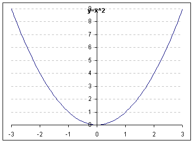
These two dialog box entries specify the domain over which the graph is to be drawn. For example, in the graph shown in the introduction the minimum value would be 0 and the maximum would be 10. Each of these dialog box entries can be either a number or a reference to a single cell, which would contain a number.
The minimum and maximum values are required for the first function and are optional for subsequent functions. If either or both are not specified, the software will use the value from the previous function.
The TM Plot Manager software draws a "draft" graph using the number of points specified in the 'Minimum (to Start with)' dialog box entry. It refines its work and stops when it has at least as many data points as specified in the 'Maximum (to stop)' entry. See the advanced tips section for more information on how the judicious use of these two dialog box entries can significantly improve the graph.
For each specified function the software adds a new worksheet. In this sheet, it computes the X and Y values (in columns A and B) as well as various additional information in columns C:F. In addition, the plot conforming to this function is in a chart embedded in the worksheet.
If the software is asked to plot multiple functions, it adds an extra chartsheet. The chart in this sheet contains all of the specified functions.
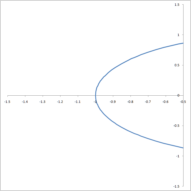
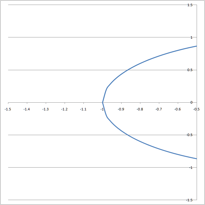
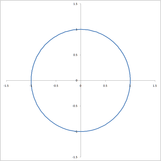
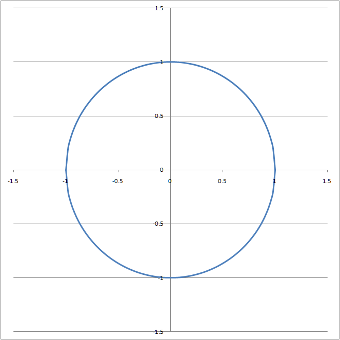
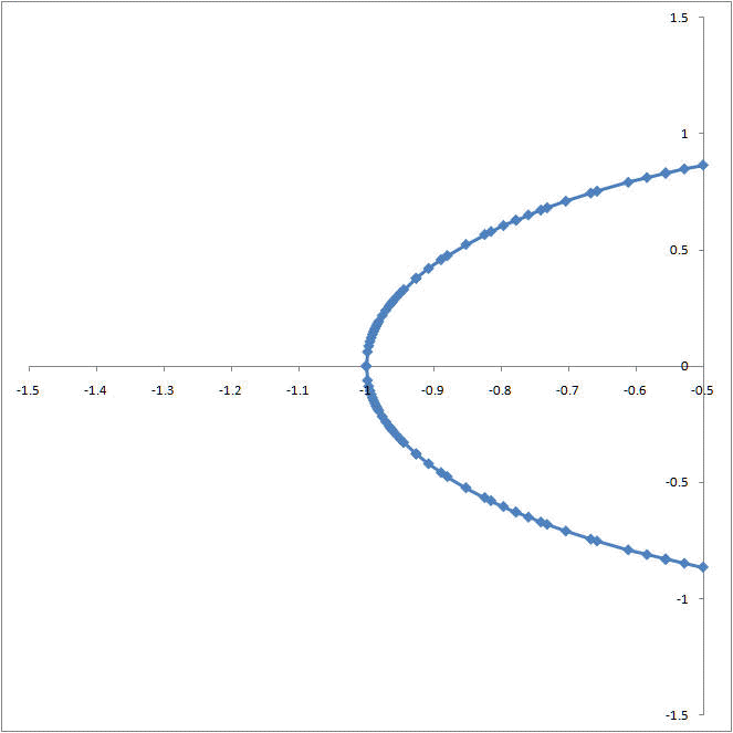
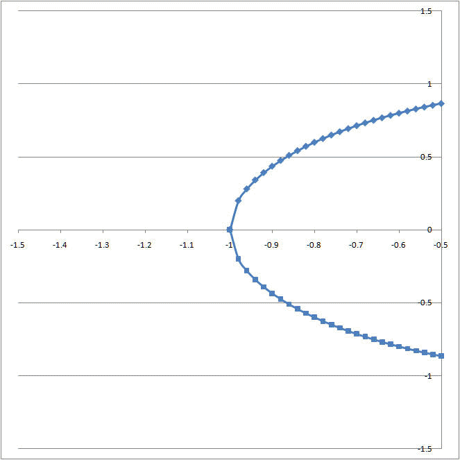
The software draws smoother curves by concentrating its efforts on those portions of the graph with a greater curvature. The importance of this uneven distribution of data points is best illustrated through an example. Consider the circle drawn in Figures 6 and 7. In Figure 6 (drawn with TM Plot Manager) the line is smooth at x = -1 and x = +1. By contrast, in Figure 7 (drawn with equidistant points in an Excel worksheet) the lines at x = -1 and x = +1 meet at an angle! One can see the effect in more detail by zooming in on the x range of -1.5 ≤ x ≤ -0.5 as in Figure 8 and Figure 9.
In creating the data for the graph, it starts by checking the function at some number of x values. How many values it uses to start is controlled by the dialog box entry Minimum (to start with). It subsequently doubles the number of data points it uses. However, it does not allocate these new data points in an equidistant fashion as the first time around. Instead it uses the information about the curvature of the graph at each of earlier data points and uses more points in the areas where the curvature is greater.
The program keeps on doubling the data points it uses until it has more than the number specified in the dialog box entry Maximum (to stop).
The reason why Figure 8 is smooth is because TM Plot Manager used many more points near x = -1 as compared to elsewhere (see Figure 10). By contrast, Figure 9 had an uniform number of points across the x axis (see Figure 11).
Improve a difficult-to-graph function (such as a step function)
Comparing the graph of Tan(x) drawn with the Plot Manager and an Excel table
The graphs below are the PLOT Manager results for various functions. Click on a thumbnail to see the original graph.
|
|
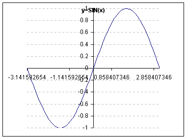 y=sin(x) |
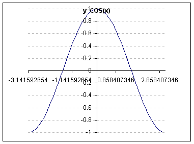 y=cos(x) |
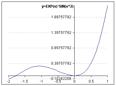 y=ex*sin(x2) |
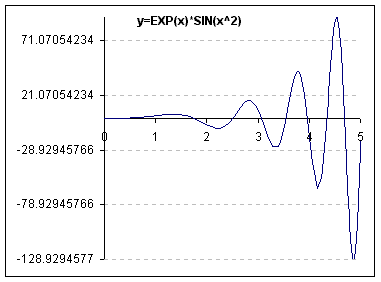 y=ex*sin(x2) |
 y=tan(x) |
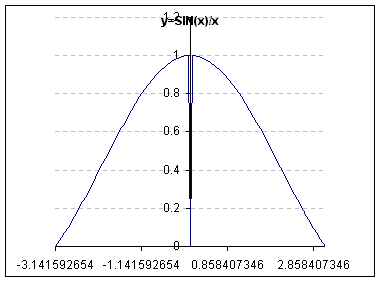 y=sin(x)/x |
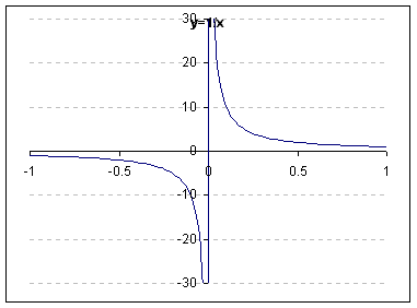 y=1/x |
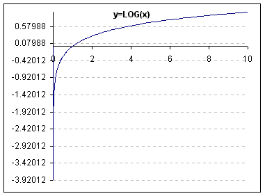 y=log(x) |
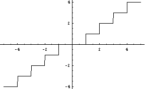
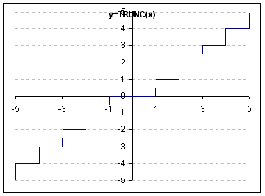
 Step function y=trunc(x) |
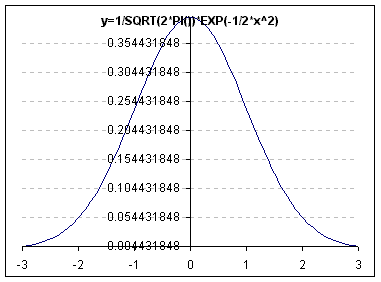 Standard normal distribution, 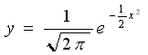 |
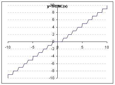
As it happens a function with a lot of sharp twists is difficult for a software program to plot. The step function, y=Trunc(x) has lots of sharp turns. The results of plotting the function three different ways is shown below. Note that the Plot Manager does much better than a more straightforward way, such as with the use of an Excel Table. In addition, the Plot Manager is comparable to the result of Mathematica, a much more sophisticated and expensive program. One might even argue that Mathematica fails to do a complete job since it misses the the two points (-5, -5) and the (5, 5) points altogether!
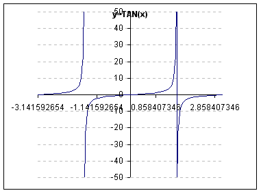
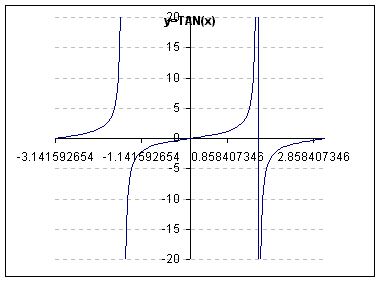
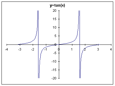
The function y = Tan(x) is another demonstration of how the Plot Manager software does a better job of graphing functions than more common methods. In this case, the function has two asymptotes, at x = -p/2 and at x = p/2 respectively. Note that the x values correspond to x = -90° and x = 90°. The results with the Plot Manager and with an Excel data table are shown below.
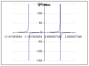 Tan(x) with the Plot Manager |
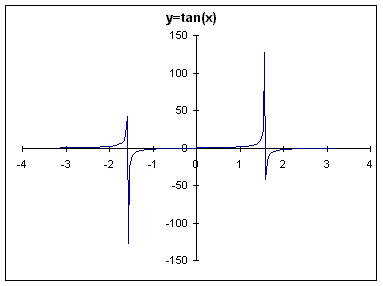 Tan(x) with an Excel table |
The graph on the left clearly identifies the asymptotes as shown by the vertical lines at x = -p/2 and at x = p/2. In the chart to the right, the function does not clearly show that it goes to +¥ or to -¥.
It is possible to improve the appearance of the graph which has asymptotes by reducing the range of the y-axis, as shown below.
 Tan(x) with the Plot Manager with a restricted y-axis |
 Tan(x) with an Excel table with a restricted y-axis |
In the two examples above, the y-axis is restricted to values between -20 and +20. Note that the result of the Excel table now looks much better. However, the asymptotic nature of the graph is still more easily noticed in the PLOT Manager output.
While people would have no problem visualizing a step function such as y=Trunc (x), most software programs have difficulty plotting it. This is because there are so many 'sharp edges' (jumps) in the function.
In cases such as this, where we know something about the function's behavior, it helps the software if we give it additional guidance. Consider plotting the Trunc(x) function from x = -10 to x = 10 with the Plot Manager. Starting with 5 data points and ending with 100 yields the plot on the left below. Notice there are many instances where the software draws line at an angle rather than a vertical line.
|
|
|
Since we know about the discontinuities at each integer value, telling the software to start with 21 points and continuing until it has at least 200 yields the curve on the right. Notice that most, though not all, of the transitions that occur at integer values are are now drawn with vertical lines. Of course, since we changed the number of starting points and the number of ending points, can we tell which was responsible for the improvement?
To help answer that question, we look at the same function, Trunc(x), plotted from x = -5 to x = 5 (as shown below).
|
|
|
On the left above, the software started with 11 data points and finished with 100, while on the right, it started with 11 and finished with 200 data points. Notice that there is no perceptible difference between the two graphs. Consequently, we can conclude that it was information about the 11 distinct x-values that helped it draw a better graph. Remember that we knew, from our knowledge of the function, that it changes in an abrupt fashion at each of the 10 non-zero integer values between -5 and +5 .