A contest judged by a group from mrexcel.com and Microsoft focused on visualizing data in Excel with PowerPivot where the data came from the Azure cloud data service. The details are at http://www.mrexcel.com/Challenge2011/challenge_52011.html.
I won one of the 2 prizes based on my three contest submissions (http://www.mrexcel.com/Challenge2011/challenge_52011_win.html). This post summarizes the three entries. My plan is to discuss each in detail in separate follow up posts and hopefully include the associated Excel file so that others can explore each approach by themselves.
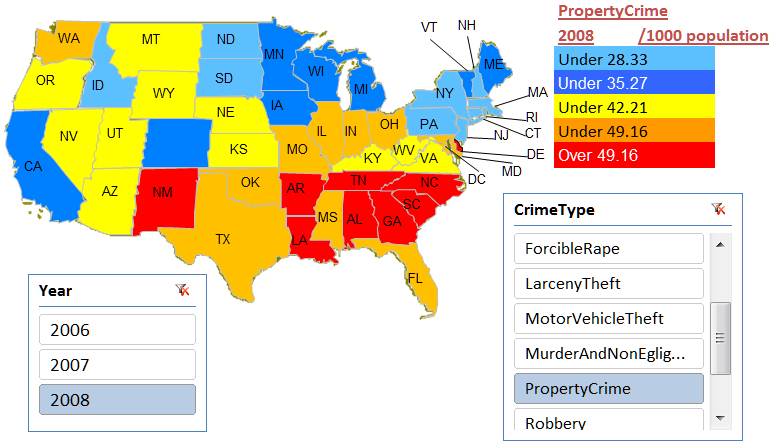
I am a strong proponent of showing data in a way that is natural to the underlying context. I chose a crime statistics data set. It contained the number of acts of different types of crimes for different U.S. cities for the period 2006 to 2008. While one could do something with the city level data, I opted to summarize the results at the state level and display the result in a map of the U.S.
The first one leveraged a solution I created some years ago that conditionally colored individual shapes in a worksheet. The shapes can represent any entity that makes sense in the context of the data. In this case, the shapes represented U.S. states.
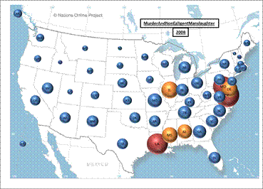
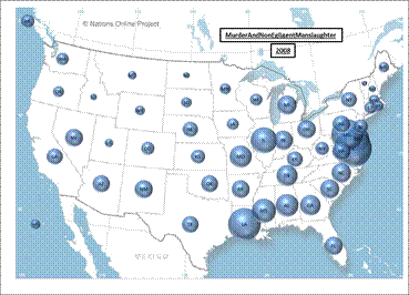
The second entry was a very creative way of displaying data in an Excel chart, if I say so myself, while retaining the visual effect of the data being shown in the context of a U.S. map. I accomplished this with (1) a bubble chart, (2) an image of a map of the U.S. as the plot area background, and (3) adjusting the X and Y coordinates of the data so that the bubble representing a particular state appeared in the correct location in the map. Then, I used multiple series, each formatted differently, to create the effect of conditional colors.
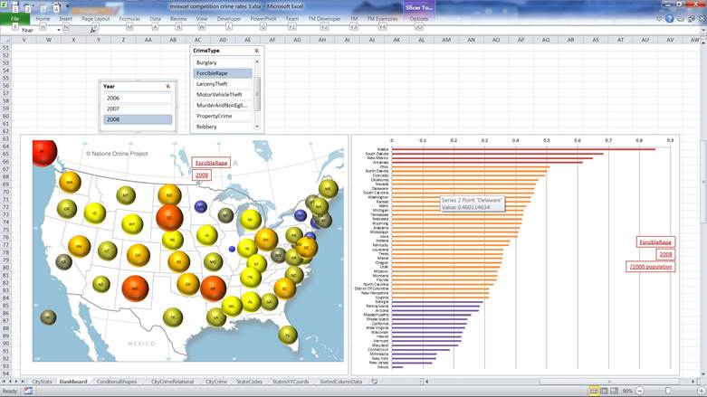
Of course, there are other very valid ways of visualizing data and the dashboard also contained a sorted bar chart. This chart showed the data ranked by state from most crimes to least crimes.
I intentionally left elements of the Excel environment visible. While they contribute nothing to the dashboard, they do remind the reader that this is an Excel dashboard. Since the map did not include Alaska or Hawaii, I located the bubbles corresponding to those 2 states in the general direction of the respective state.
The third entry contained two charts both similar to entry 2, just simpler in that I used only 3 colors in one chart and a single color for another chart. In the single color chart, I increased the transparency of the bubbles. This lets one see more clearly overlapping bubbles.