Interactively graph any Excel formula as a function of a single variable. Create either a XY (Cartesian) plot or a Polar plot.
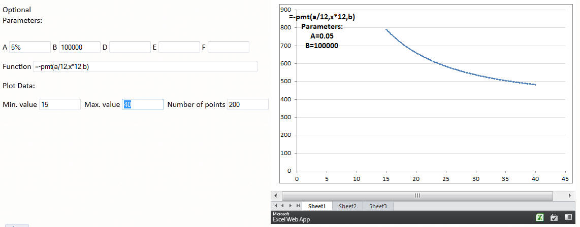
Update the various fields in the form below and simply TAB or ENTER to update the graph. As an example, to see how the monthly payment for a mortgage would vary with the duration of the mortgage, do the following: designate A as the annual interest rate and B as the principal. So, enter, say 3% in A and 100,000 in B. Then, in the formula field enter =-pmt(A/12,X*12,B). Finally, set the min. value to 15, the max. value to 40, and the number of points to, say, 200. For more see Monthly mortgage payment as a function of the loan duration.
For the curious reader, this webpage uses the new "Excel mashup" capability to integrate the information on the web page with the information in the Excel workbook.
The formula can include up to 5 optional parameters, named A, B, D, E, and F. So, to plot a normal distribution with the mean given by A and the standard deviation given by B, one would use =NORM.DIST(X,A,B,FALSE). Now, enter the desired mean in the field A and the standard deviation in the field B.
After entering a value in any field TAB or ENTER to update the chart.
Monthly mortgage payment as a function of the loan duration
To plot a standard normal distribution, the formula would be =NORM.S.DIST(X,FALSE).
To see how the monthly payment for a mortgage would vary with the duration of the mortgage, do the following: designate A as the annual interest rate and B as the principal. Then, use the formula =-pmt(A/12,X*12,B). Specify the minimum X value (the number of years) as 15, the maximum x value as 40, and ask for 200 data points.
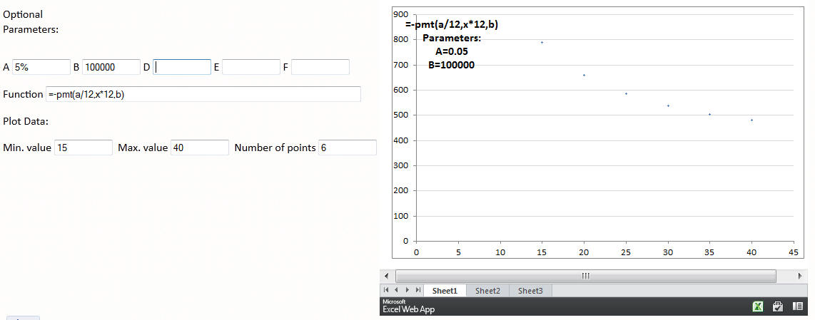
Of course, the typical mortgage is available for only certain durations such as 15 years, 30 years, or 40 years. So, to see the discrete points, reduce the number of data points to, say, 6. This will yield x values from 15 to 40 spaced 5 years apart. The points are not very dark (because the default marker size is 2 pt) but one can see the monthly payments at each of the specific loan durations.
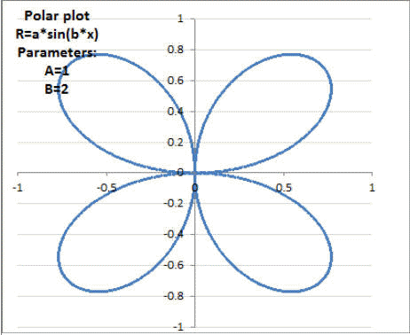
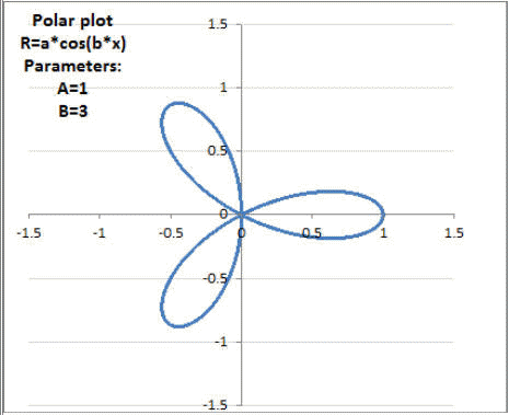
| Rose | A*sin(B*X) |
 |
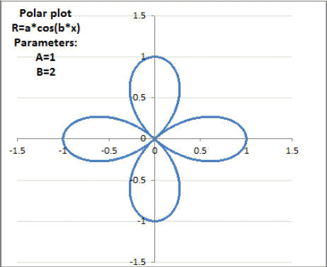
| Also A*COS(B*X) |
  |
|
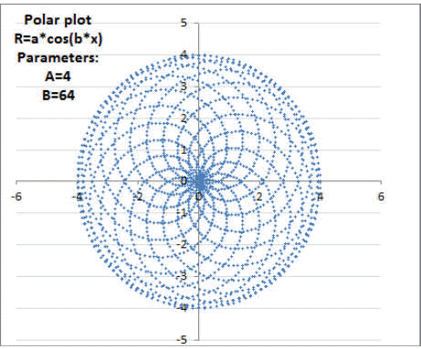
| "Sun" | Rose with a large B, e.g., 4*COS(64*X) |
 |
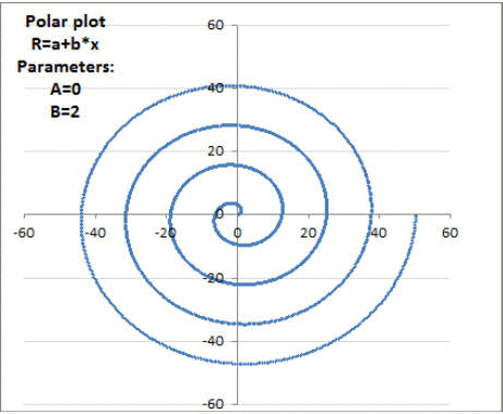
| Spiral | A*X+B |
 |
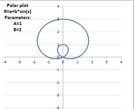
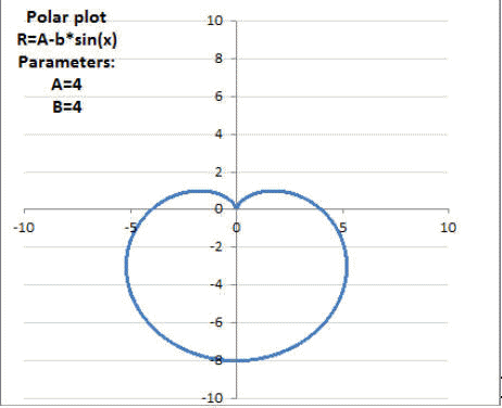
| Limacon | A+B*SIN(X) A-B*SIN(X) A+B*COS(X) A-B*COS(X) |
 |
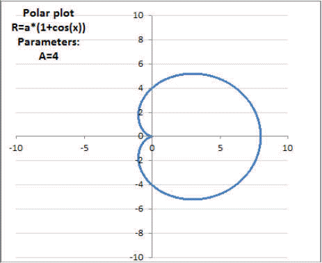
| Cardioid | Limacon with A=B, e.g., 4-4*SIN(X) 4*(1+COS(X)) |
  |
| Ellipse | A*B/SQRT((B*COS(X))^2+(A*SIN(X))^2) |
 |
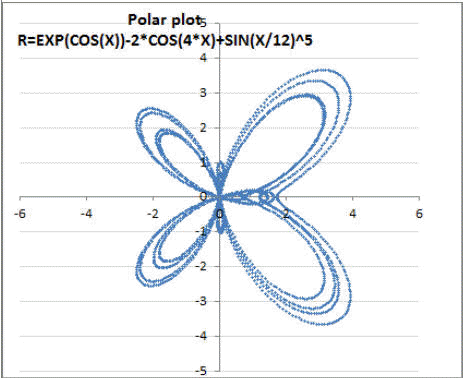
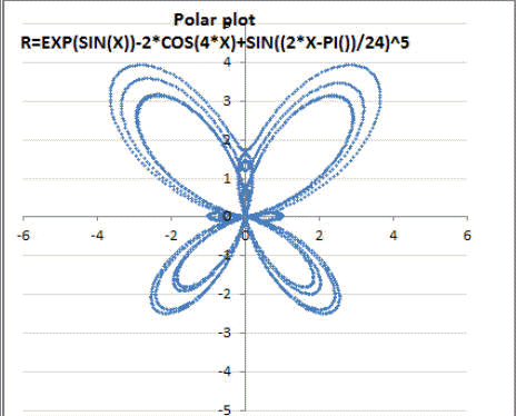
| Butterfly |
EXP(COS(X))-2*COS(4*X)+SIN(X/12)^5 0 <= X <= 8*PI() |
 |
| 4*cos(10*cos(x)) |
 |
|
|
EXP(SIN(X))-2*COS(4*X)+SIN((2*X-PI())/24)^5 0 <= X <= 8*PI() |
 |