Part 1: http://www.dailydoseofexcel.com/archives/2010/02/26/powerpivot-part-1-of-4/
Part 2: http://www.dailydoseofexcel.com/archives/2010/02/27/powerpivot-part-2-of-4-prepping-the-census-data/
Part 3: http://www.dailydoseofexcel.com/archives/2010/03/02/powerpivot-part-3-of-4-conditional-shape-colors/
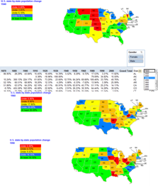
In this tip I discuss integrating the result of a PowerPivot analysis of a large data set (18 million records) into a geographic map using a method I call “Conditional Color of Shapes.”
PowerPivot (occasionally referred to as PP in the rest of this document) is a free Excel 2010 add-in from Microsoft. It has not yet been officially released though a Community Technical Preview (CTP) version is available from www.powerpivot.com and a Release Candidate (RC), the latest version as of early March 2010, from connect.microsoft.com. The latter may require registration and I don’t know if the RC is restricted to certain people or not. While a fairly powerful set of functionality is available in the standalone PP add-in, additional capabilities, such as using one PP database as the source for another PP database, require a complementary PowerPivot add-in on a SharePoint server. For the purpose of this exercise the standalone version is more than sufficient.
The product implements an in-memory database with what Microsoft calls columnar compression of data. Technical details aside, the product allows one to create a very large database (with tens of millions of records) on-the-fly and analyze it with outstanding performance. PP also includes various functions for data analysis and features a built-in PivotTable and Chart capability, one that is different from Excel’s capability.
For additional information on PowerPivot visit the official website at www.powerpivot.com or the team blog at blogs.msdn.com/powerpivot. Alternatively, search Google for other sites including some by Microsoft or ex-Microsoft employees. Of course, PowerPivot is so intuitive that you shouldn’t need any help getting started. For some of its more advanced functions maybe access to information might be useful but to get started… if you have used functions and PivotTables in Excel, tables in Excel 2007, and, optionally, MS Query for Excel… you already know how to use PowerPivot!
To install PP double-click the downloaded file. I did so after closing Excel 2010 so I cannot comment on what will happen if you have Excel running during the installation process. On running Excel after the installation completes you should have a new tab named PowerPivot.
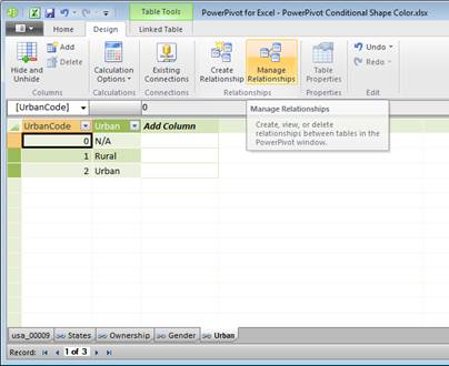
Open the workbook from Part 3 of this post. This contains the implementation of the U.S. map as part of the Conditional Color of Shapes.
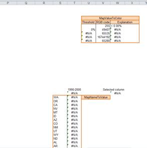
Move the ranges used in the various mappings further to the right so that MapValuesToColor and MapNamesToValues are in column R (or beyond).
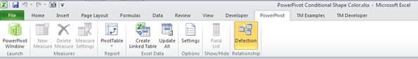
Next, click the PowerPivot tab | PowerPivot Window button to open up the PowerPivot add-in in its own window.
The window will be empty with the exception of the ribbon and it will remain so until we create a table. After creating a table (two ways are discussed later) the window will look amazingly like Excel’s – a grid showing cells with columns and rows. One notable exception: there are no row numbers and the columns either have names or generic labels F1, F2, etc. Multiple tables show up as tabs in the bottom left of the window.
The first thing to do is import the text file created in part 2 of this post. Click the From Text button to bring up the Table Import wizard. Specify Column Separator as Comma, check ‘Use first row as column headers’, click Browse… and select the output file from part 2. PowerPivot will show the first few records in the dialog box.
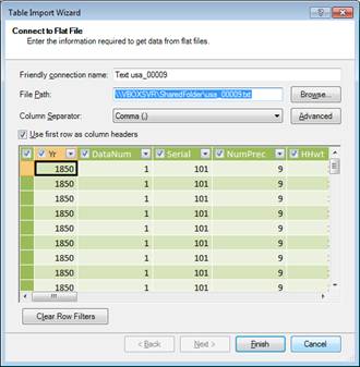
Click Finish. Once PP completes the task it will display a summary of the result. In this case, it shows that it has completed the import of nearly 18 million records
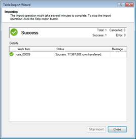
Click Close to dismiss the wizard and PP will show the imported data in a table.
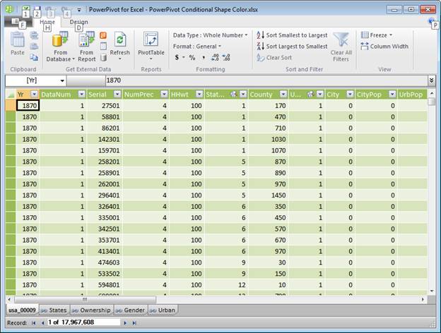
As noted in the Part 2 post, the census data are all numeric. In those cases where the natural context is text (state names, gender, etc.), the IPUMS website provides a table of the numeric values and the corresponding text. I pasted several of these tables into ranges in an Excel worksheet and converted each of those ranges into an Excel table – an important step because PowerPivot understands the concept of an Excel table. Once all the ranges are converted to Excel tables, click in any one of them, and then from the PowerPivot tab click the Create Linked Table button.
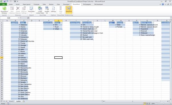
PowerPivot imports that Excel table into PowerPivot and adds it as a table in its in-memory database.
Change the default name of the table (Table{N}) to a more application-appropriate name by double-clicking the tab and entering the new name (this is just like changing the name of an Excel sheet). Next, create a link between the different PP tables using the Create Relationship or the Manage Relationship button.
Click Manage Relationships to bring up the Manage Relationships dialog box. Click the Create button to add a relationship between two tables.
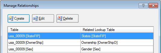
To define a relation between two tables select one of them in the Table dropdown and the other in the Related Lookup Table dropdown. For each table specify the column that defines this relationship. In Figure 1 both tables have columns with the same name StateFIP, though there is no requirement that the names of the columns be the same. What is important that the 2 columns contain data that logically connect the two tables.
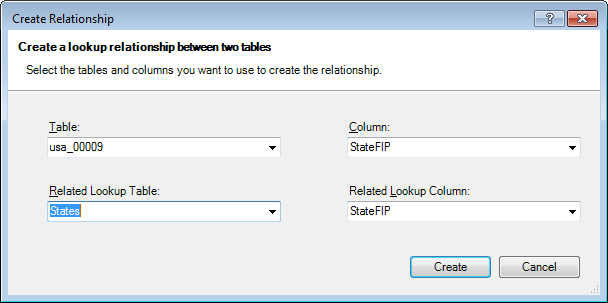
Figure 1
Figure 2 shows the relationships between the primary data table, usa_00009 and some of the tables containing the text descriptions for the numeric values in the census data.
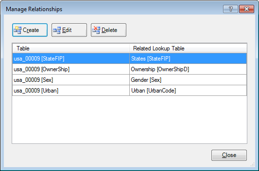
Figure 2
To analyze the data in PP select one of the options from the drop down Home tab | PivotTable dropdown.
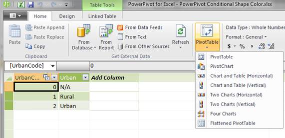
Since the visual display will be the geographic map of the U.S., create just a PivotTable – insert it to start in cell A23. PP will switch back to Excel and create an empty PivotTable. The Task Pane (TP), though it might look like a PivotTable TP, is a PowerPivot TP.
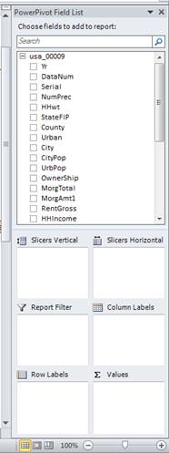
Click and drag the year (Yr) to the Column Labels area. PowerPivot also shows the linked tables (see Figure 3). Click the + next to the States table and click and drag the State field to the Row Labels area. Finally, click and drag the PerWt field to the Values area.
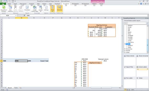
Figure 3
Finally, select the data field in the PT (right-click the Sum of PerWt cell and select Value Field Settings…) and change the data shown to be the % difference from the previous year (see Figure 4).
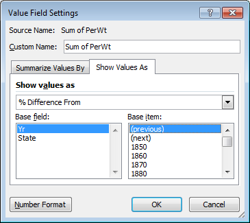
Figure 4
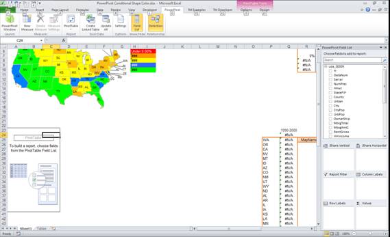
The result should look like Figure 5
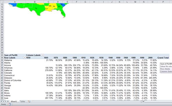
Figure 5
Since the visual display uses the 2 letter state abbreviations and the PT contains the full name of the state, we need to connect the two. The easiest way would be to add the full names in an adjacent column as shown in Figure 6 and appropriately modify the lookup formula in column T. The formula in T24 (and copied down column T) is =INDEX($B$25:$P$78,MATCH(R24,$A$25:$A$78,0),$W$24). Make sure that the references line up correctly. The reference to row 25 in the formula is correct because that is the row with the data for the first state (Alabama). The reference to column B is also correct because that is the column with the data for the first census year (1850).
Modify the data validation in cell T23 so that the list refers to =$B$24:$O$24.
The result should look like Figure 6.
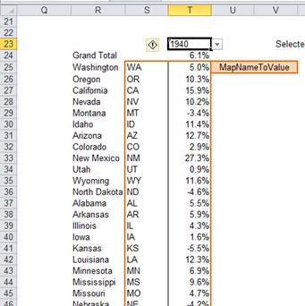
Figure 6
And, that should be it. The rest of the stuff should just fall into place. As long as the Conditional Color of Shapes add-in is active, the individual shapes in the map should respond to changes in T23 (the cell with the dropdown for the census years).
Think of a slicer as a filter. With an Excel PivotTable, one could filter data using any row field or column field or even a data field. But, in each of these cases, the field is part of the PT. A slicer is a way to filter data without making the field a part of the PT. To create a slicer, in the PT Task Pane, click-and-drag a field to either the Slicers Vertical or the Slicers Horizontal region. Once the slicer shows up on the worksheet canvas, drag it anywhere you like.
Customize the slicer through the Slicer Tools contextual tab. For example, one can change the number of columns shown in the slicer. Another very useful feature is that one can apply the same slicer to multiple PTs. Use the PivotTable Connections button (of course, it would help to have two or more PTs).
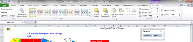
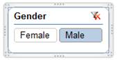
To see the effect of the Gender field as a slicer, after adding it to the worksheet, click either the Male or Female button. The PT and the map will change to reflect the data specific to the selected gender. To reset the slicer click the red x in the top right corner.
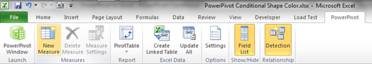
PowerPivot includes a set of functions, some of which are useful within the PowerPivot window and others that are more useful in the Excel window. Click the PowerPivot tab | New Measure button.
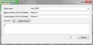
In the Measure Settings dialog box, click the fx button.
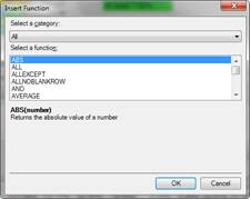
Explore the various functions in the resulting Insert Function dialog box.
PowerPivot is a powerful new capability introduced by Microsoft that works very well in conjunction with Excel 2010. In this article, I looked at how to analyze nearly 18 million U.S. Census records with PowerPivot and to tie the result to a visual display of set of shapes configured to look like the states of the U.S.